Typeface Design
Unity
A display typeface built from the rope of a Catholic altar server's medallion, developed through research into St Giles Church and presented as a full type specimen.
A display typeface built from the rope of a Catholic altar server's medallion, developed through research into St Giles Church and presented as a full type specimen.
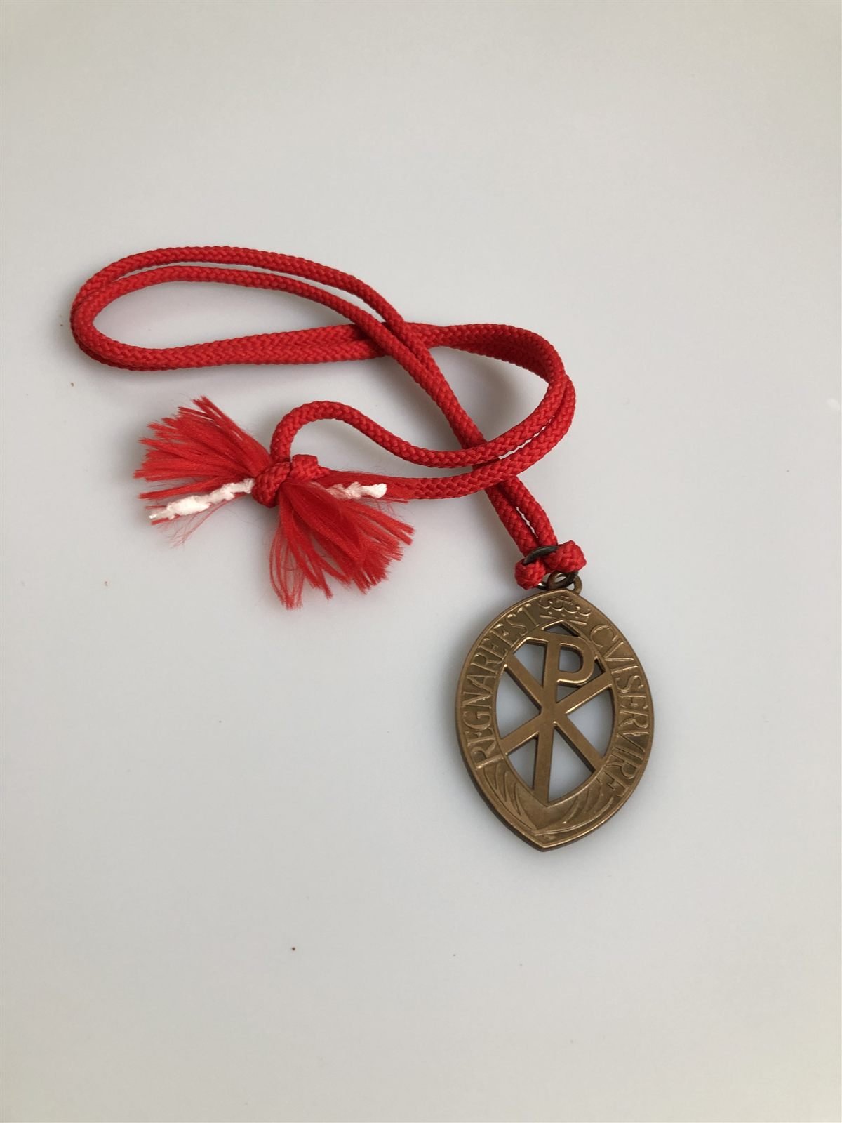
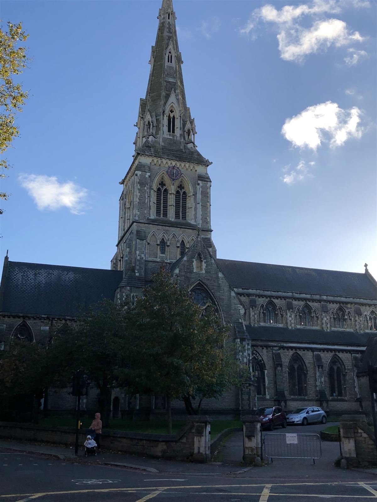
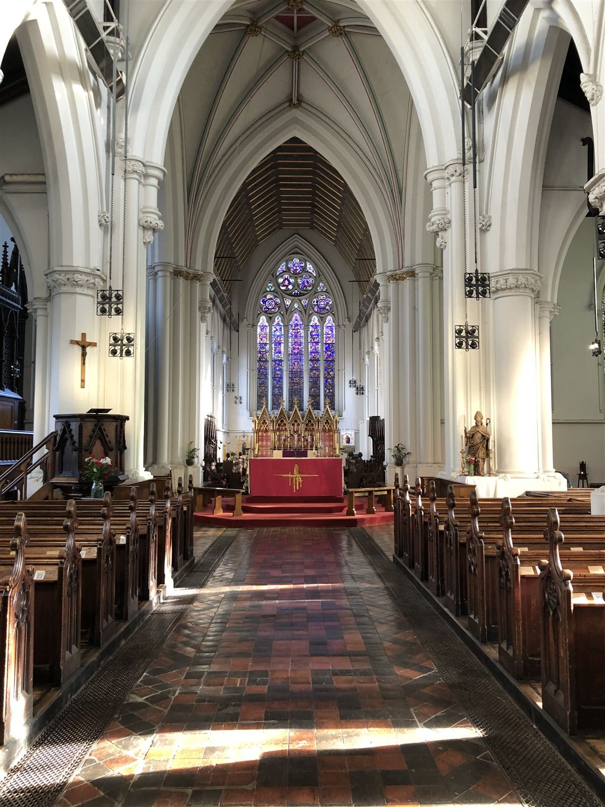
The brief asked for a typeface grown out of primary research into a specific place. I looked into St Giles Church and its Catholic tradition, and kept coming back to a detail from my own experience as a former altar server: a rope necklace medallion, worn as a small everyday object carrying a much larger meaning.
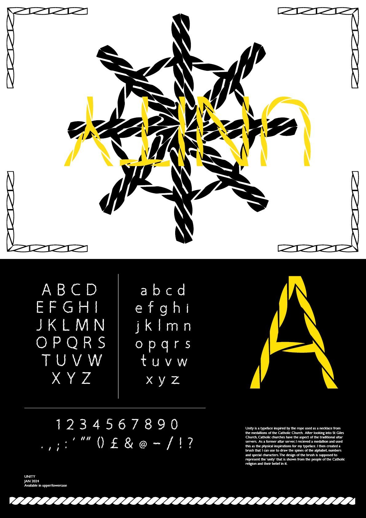
I built a hand-drawn brush from a photographed length of rope, then used it to construct every letterform, numeral and punctuation mark in the set — twisted, knotted strokes standing in for the "unity" the rope was meant to represent. The finished typeface, Unity, is presented as a full specimen poster: a large decorative lockup, the complete upper and lowercase alphabets, numerals and punctuation, and a short rationale explaining the research behind it.
Every letter had to look like it was tied, not drawn — the brush came before a single character was built.