Brand Identity & Website
C.H.A.D.S
A full brand identity and website for Creative Hands Achieving Dreams (C.H.A.D.S), a community organisation combining food, creativity and life-skills programming for young people.
A full brand identity and website for Creative Hands Achieving Dreams (C.H.A.D.S), a community organisation combining food, creativity and life-skills programming for young people.
C.H.A.D.S needed an identity that could hold together a wide, informal programme — youth nights, workshops, holiday projects, community meals — and travel across everything from a T-shirt to a website. Nothing existed beyond a name and a mission. The identity had to feel warm and community-led rather than corporate, and had to be genuinely usable by non-designers running the day-to-day of the charity.
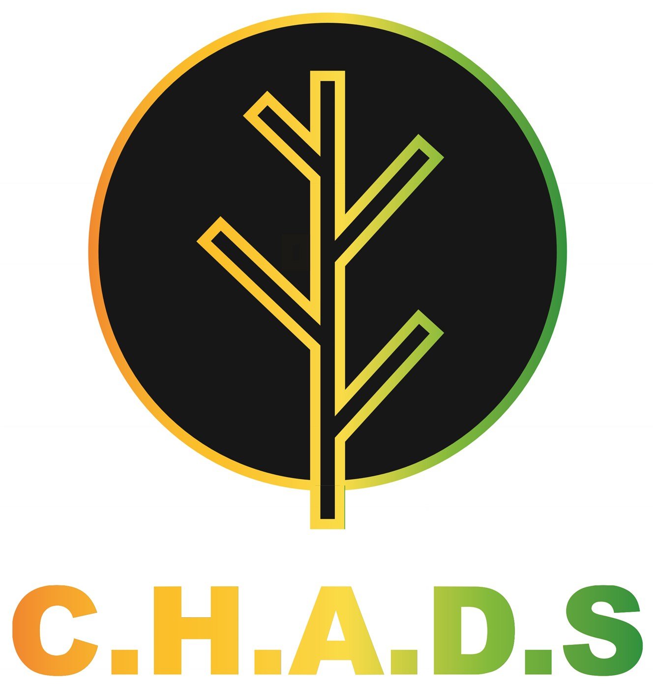
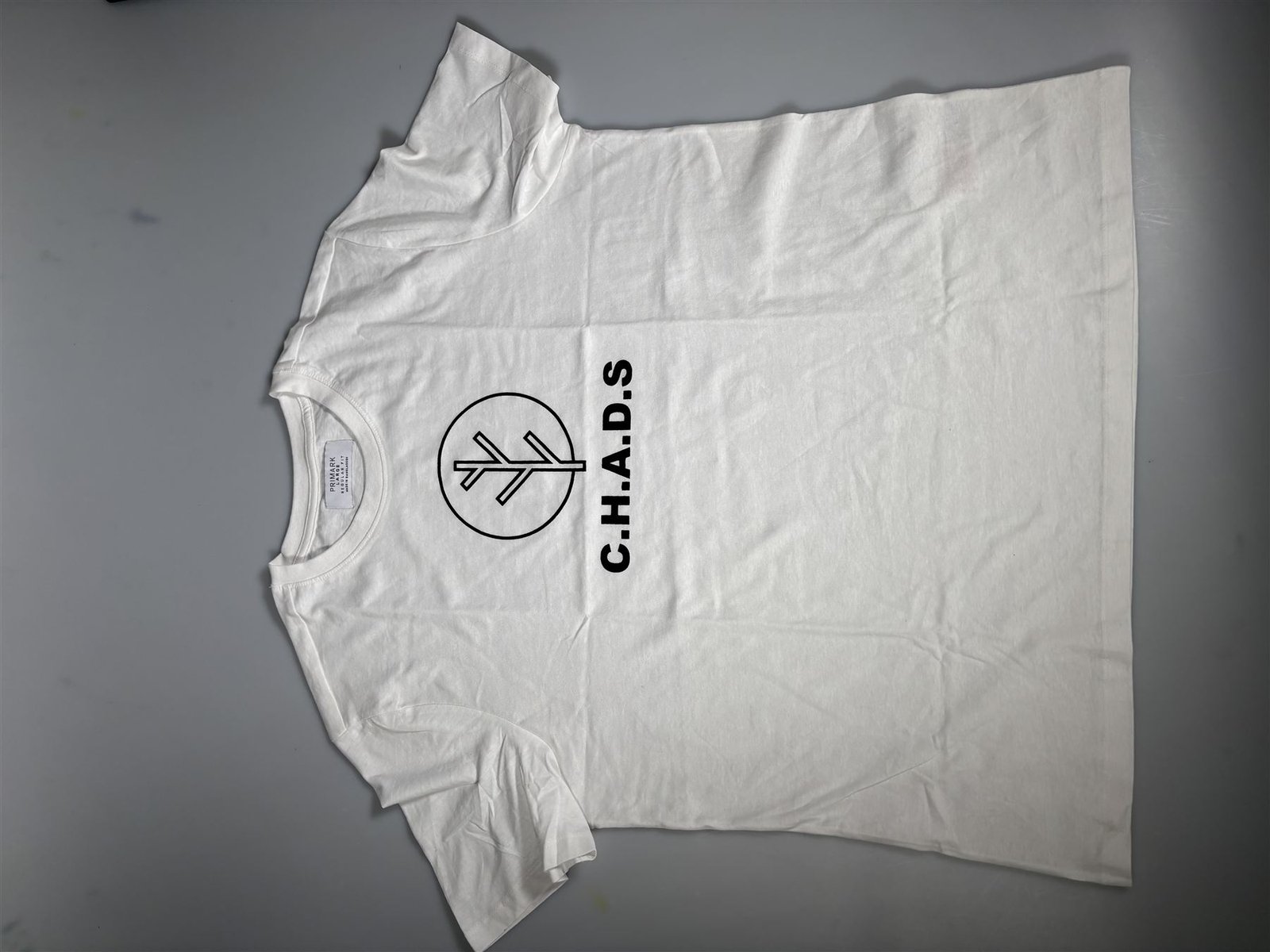
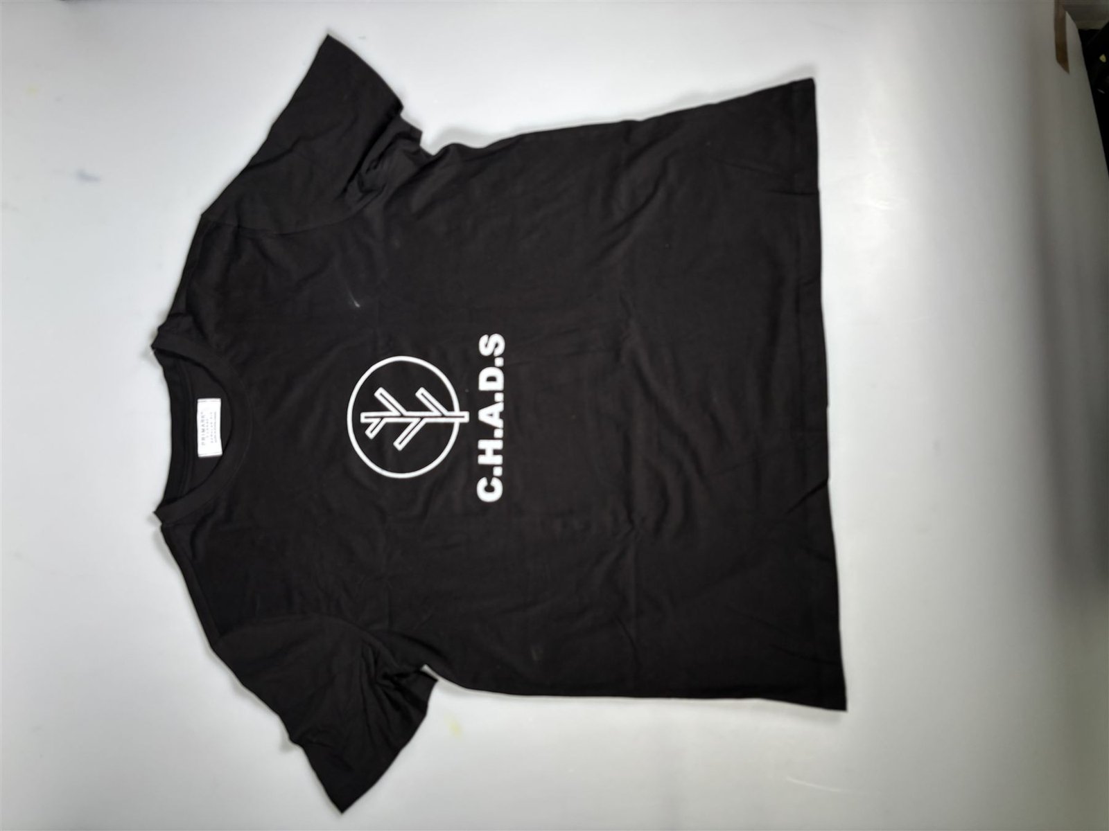
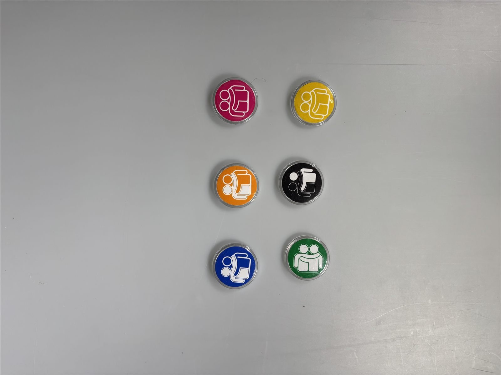
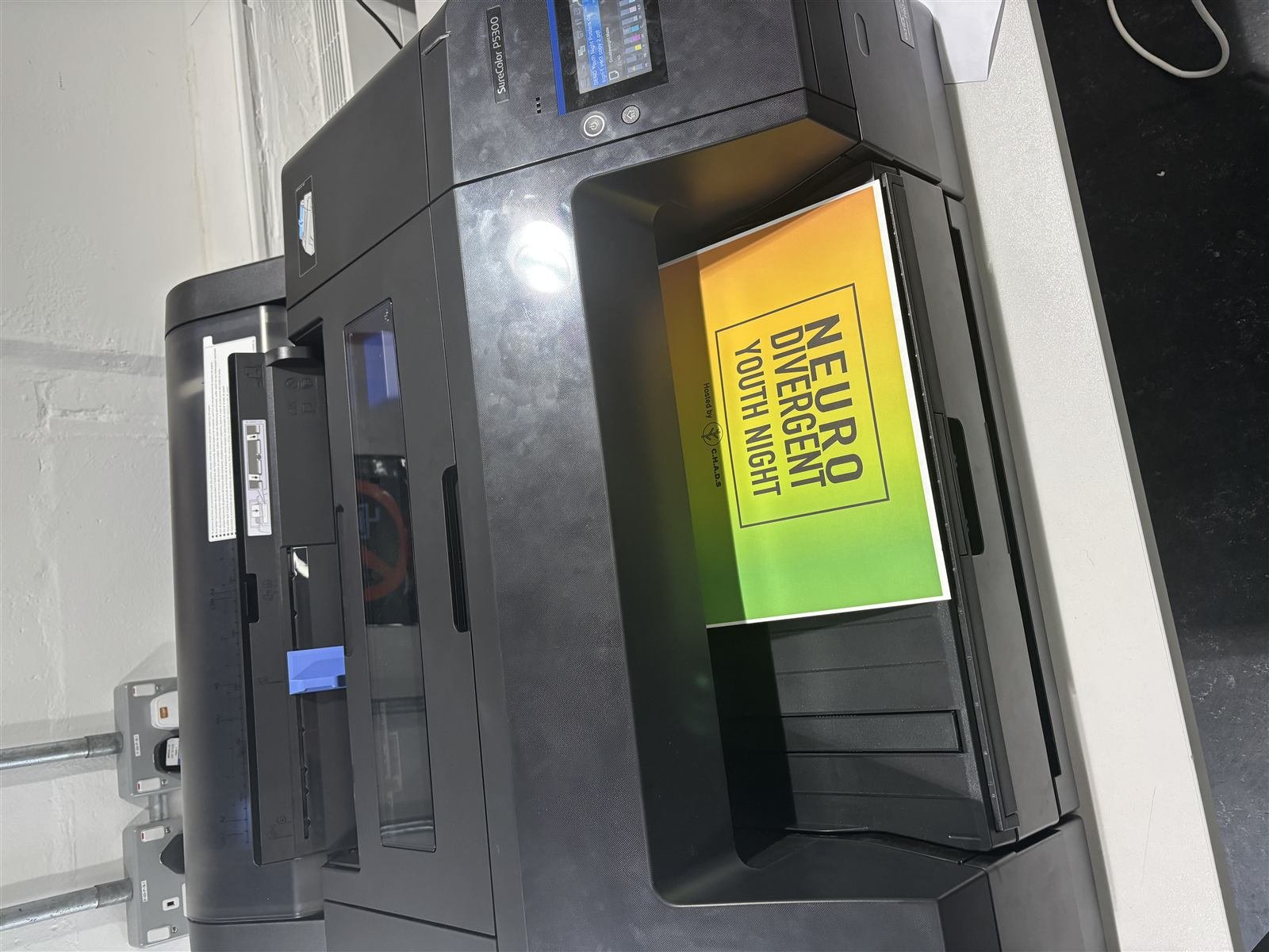
I designed the full mark — a tree motif standing in for growth and shared roots — built out a brand manual covering colour, type and usage rules, and then applied the system across screen-printed T-shirts, enamel-style badges, tote bags and printed event posters. I designed and coded the charity's website from scratch: eight pages, a shared CSS system, working contact and sign-up forms, and a mobile navigation, built with no framework so it stays easy to maintain.
The identity had to survive being screen-printed onto a T-shirt by a volunteer just as well as it survived on a screen.
The brand's gradient (green through orange to yellow) reappears throughout the site as the primary visual signature, paired with a dark charcoal nav and footer so the colour always reads as an accent rather than noise.
The site itself is a working deliverable, not a mockup — eight linked pages sharing one stylesheet, with a mobile hamburger nav, an FAQ accordion, and client-side validated forms across contact, sign-up and newsletter sign-up.